Today was a rare bust. We were planning to leave Tucson and head northwest, but suddenly a pile of work issues popped up and the next thing I knew it was 11 a.m., check-out time, and I was still in my pajamas in front of the laptop.
So we paid for another day and I spent the rest of the day tapping the keys. We’ll hit the road tomorrow instead.
One reason I was so busy is that a few last-minute touches needed to be made on the Summer magazine. I finished editing it six weeks ago, but there’s still work to be done as the layouts are completed, and when it goes to the printer there are still more tasks.
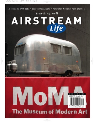
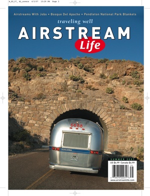
Since we’ve completed the bulk of the work and it’s now mostly in the hands of the printer, I can take a moment to share with you a peek into the process. Long-time readers of this blog know that we test alternate covers before choosing the final cover of the magazine. The image above is one such test (headlines are taken from the previous issue).
Here are two other tests we did for the Summer issue (above, and below). We also considered several other photos. None of them made the final cut. You’ll have to wait for the issue to appear in print, later in May, to see the image we ultimately selected!
Starting with the Fall issue, Airstream Life will have two covers: one for subscribers, and another for book stores. The photos will be the same, but the headlines will be different. Subscribers will see only the three small headlines above the magazine’s title, which we’ve always put on the cover. Copies intended for book store distribution will have more headlines (called “sell lines” in the industry). So a benefit of subscribing will be to get the cleaner-looking cover (and at a better price).


